-
Python 데이터분석 기초 18 - 차트의 종류Python 데이터 분석 2022. 11. 2. 12:17
# 차트의 종류 경험하기 : data의 성격에 따라 차트를 적용하는 것이 중요함.

import numpy as np
import matplotlib.pyplot as plt

# 차트 영역 객체 선언시 matplotlib 스타일 관련 인터페이스 유형
# x = np.arange(10)
#
# # 방법1 : matplotlib 스타일
# plt.figure()
# plt.subplot(2, 1, 1) # row, column, panel number(active)
# plt.plot(x, np.sin(x))
# plt.subplot(2, 1, 2)
# plt.plot(x, np.cos(x))
# plt.show()
#
# # 방법2 : 객체지향 인터페이스
# fig, ax = plt.subplots(2, 1)
# ax[0].plot(x, np.sin(x))
# ax[1].plot(x, np.cos(x))
# plt.show()

# 방법 1과 비슷한 방법
# fig = plt.figure() # 명시적으로 차트영역객체 선언
# ax1 = fig.add_subplot(1, 2, 1) # 1행 2열
# ax2 = fig.add_subplot(1, 2, 2)
#
# ax1.hist(np.random.randn(10), bins = 5, alpha = 0.9) # 데이터 구간 수 : bins
# ax2.plot(np.random.randn(10))
# plt.show()

# 세로 막대 그래프 호출
# data = [50, 80, 100, 70, 90]
# plt.bar(range(len(data)),data)
# plt.show()
#
# 가로 막대 그래프 호출
# data = [50, 80, 100, 70, 90]
# err = np.random.rand(len(data))
# plt.barh(range(len(data)),data, xerr = err)
# plt.show()

# data = [50, 80, 100, 70, 90]
# plt.pie(data, explode = (0, 0.5, 0.1, 0, 0), colors = ['yellow', 'blue', 'red'])
# plt.show()

# plt.boxplot(data) # 전체 데이터 산포도 확인 시 좋음
# plt.show()

import seaborn as sns # matplotlib의 기능을 추가
import pandas as pd

titanic = sns.load_dataset('titanic') # 데이터를 가져옴.
pd.set_option('display.max_columns', 500)
# 데이터의 양이 많아 생략되어 나오면 함수 사용! 생략되지 않은 상태로 나온다.
print(titanic.head(3))
print(titanic.info())

sns.distplot(titanic['age'])
plt.show()

sns.boxplot(y = 'age', data = titanic)
plt.show()

ti_pivot = titanic.pivot_table(index = 'class', columns = 'sex', aggfunc = 'size')
print(ti_pivot)

sns.heatmap(ti_pivot)
plt.show()

<console>
   survived  pclass     sex   age  sibsp  parch     fare embarked  class  \
0         0       3    male  22.0      1      0   7.2500        S  Third
1         1       1  female  38.0      1      0  71.2833        C  First
2         1       3  female  26.0      0      0   7.9250        S  Third

     who  adult_male deck  embark_town alive  alone
0    man        True  NaN  Southampton    no  False
1  woman       False    C    Cherbourg   yes  False
2  woman       False  NaN  Southampton   yes   True
<class 'pandas.core.frame.DataFrame'>
RangeIndex: 891 entries, 0 to 890
Data columns (total 15 columns):
 #   Column       Non-Null Count  Dtype
---  ------       --------------  -----
 0   survived     891 non-null    int64
 1   pclass       891 non-null    int64
 2   sex          891 non-null    object
 3   age          714 non-null    float64
 4   sibsp        891 non-null    int64
 5   parch        891 non-null    int64
 6   fare         891 non-null    float64
 7   embarked     889 non-null    object
 8   class        891 non-null    category
 9   who          891 non-null    object
 10  adult_male   891 non-null    bool
 11  deck         203 non-null    category
 12  embark_town  889 non-null    object
 13  alive        891 non-null    object
 14  alone        891 non-null    bool
dtypes: bool(2), category(2), float64(2), int64(4), object(5)
memory usage: 80.7+ KB
None
C:\anaconda3\lib\site-packages\seaborn\distributions.py:2619: FutureWarning: `distplot` is a deprecated function and will be removed in a future version. Please adapt your code to use either `displot` (a figure-level function with similar flexibility) or `histplot` (an axes-level function for histograms).
  warnings.warn(msg, FutureWarning)
sex     female  male
class
First       94   122
Second      76   108
Third      144   347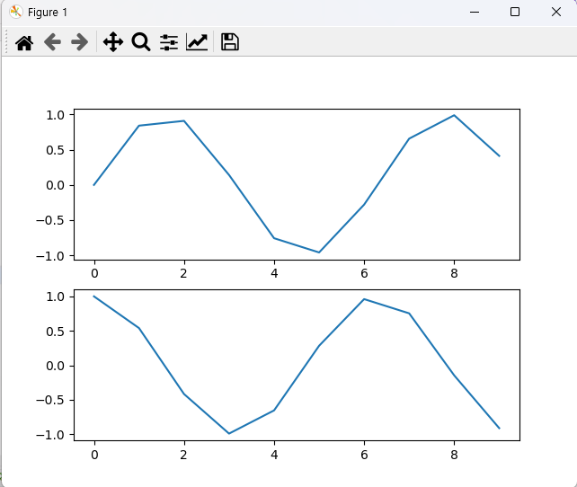
방법 1, 방법 2 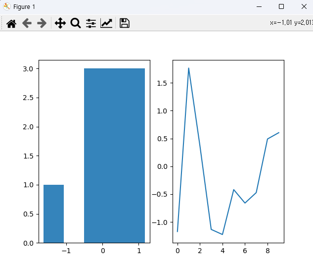
방법 1과 비슷한 방 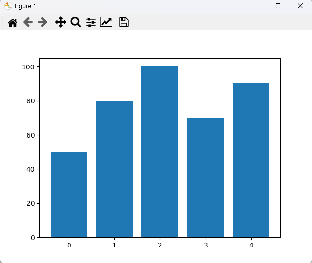
세로 막대 그래프 호 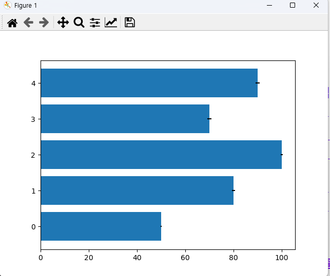
가로 막대 그래프 호 막대 그래프는 데이터의 양이 많으면 효율이 좋지 않다. 데이터의 양이 많으면 hist를 추천한다.
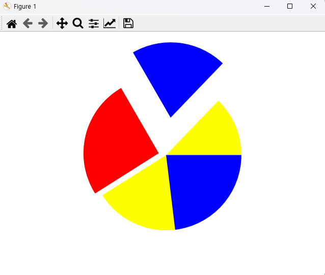
원형 차트 호출 
boxplot 차트 전체 데이터 산포도 확인 시 좋음

seaborn distplot 차트 사용 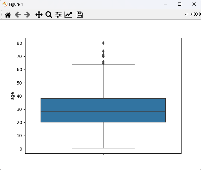
seaborn boxplot 차트 사용 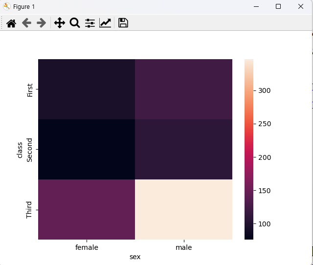
seaborn heatmap 차트 사용 'Python 데이터 분석' 카테고리의 다른 글
Python 데이터분석 기초 20 - 자전거 공유 시스템 시각화(web에서 데이터 가져옴), null 값이 있는 지에 대한 시각화, 칼럼 추가 (0) 2022.11.02 Python 데이터분석 기초 19 - yahoo 주식 데이터 시각화(파일 있을 경우) (0) 2022.11.02 Python 데이터분석 기초 17 - Matplotlib(차트 호출) (2) 2022.11.02 Python 데이터분석 기초 16 - web 에서 JSON 문서 읽기, DataFrame으로 만든 자료를 html 로 변형 (0) 2022.11.01 Python 데이터분석 기초 15 - df 자료로 슬라이싱(iloc, loc), 문자열을 int 타입으로 형변환 (0) 2022.11.01